Many of my clients have come to me with a rough idea of a logo in mind and always as about what colour palette would best suit their business.
The best answer is that every business is different and the choice of colour comes down to what you want to portray about your business, the following advice can come in handy when you are thinking about colours for your business – whether it be a logo, website or even print advertisement.
So you have a logo that’s clear, eye-catching and reproducible.
Now is the time to think about colour. Each colour can symbolise different meanings and plays a major role in human perception, and therefor influences customer intentions. Having the right colour combination can highlight your business’s strengths and draw customers to you. Obbviously the wrong combination can have the reverse effect.
Below are a few elements to consider when choosing a colour palette for your logo or brand.
Know Your Focus!
Nobody knows your business strengths and goals better than you. So when considering a colour palette, think about the message wish to convey. It is important to remember that your logo will be the first point of contact between you and your potential clients.
First, look at your brand’s personality. What do you want to highlight? Speed, bold innovation, compassion, intuitiveness, efficiency? Knowing the tone can go a long way to refining your colour choices.
Blue for example can emphasise responsibility, planning and deliberation, while reds can symbolise bold action, simplicity or innovation. A company that provides in-home care for seniors will likely have a colour palette different that is different to a company that makes toys. Identifying your focus will lead your to successful colours for your business / brand.
Try More Than One Colour
Remember this: You are not limited to one colour!
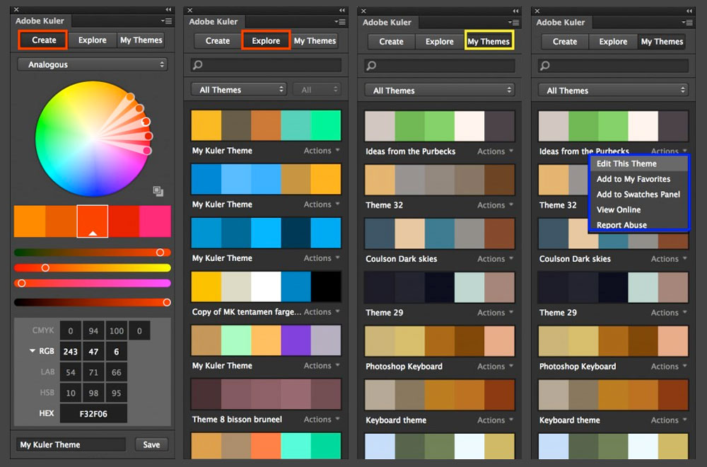
If what you choose to emphasise about your business is its variety of products, the diversity of its target audience, or its appeal to youth, you may want to go with a multi-colour design. If you decide to keep it simple, you can use two contrasting colours. Experimenting with colours is the best way to get a rough idea before deciding your final palette choice; that way you can see what works and what doesn’t. There are a number of fantastic online colour palette generators, feel free to check out Adobe Kuler, Color Lovers, Color Scheme Designer 3 or Colller.
Colours Translate
If your business is international, you should be aware of the symbolic meanings your colour palette can have when viewed in other countries / cultures. A little foresight and cultural sensitivity can go a long way to toward making effective colour choices. Click on the image below to get an in-depth understanding of what colours you choose can portray.
Make Your Business Stand Out
Everyone knows that the key to an effective logo is brand recognition. If you want to stand out from your competition, it’s a good idea to choose a colour palette that differs dramatically from your competition. Be aware of what design palettes your competitors are using and what attributes those colours emphasise, to ensure that the colours of your business / brand stand out.
If you are looking at a professional to assist you with graphic design services then feel free to contact me today. Whether you are located locally in Ballina, Lennox Head, Byron Bay, Alstonville or even Lismore or you are located inter-state; I would love to hear your ideas.


